Container Props
Props
| Props | Type | Default Value | Description |
|---|---|---|---|
| multiple | boolean | true | display multiple at the same time |
| limit | number | - | limit the number of toast displayed at the same time |
| newestOnTop | boolean | false | Display newest toast on top |
| containerClassName | string | - | Add optional classes to the container |
| dangerouslyHTMLString | boolean | false | render unsafe string, like html tag |
| clearOnUrlChange | boolean | true | clear all toasts on url change |
| icon | IconType | - | Used to display a custom icon. Set it to false to prevent |
| rtl | boolean | false | Support right to left content |
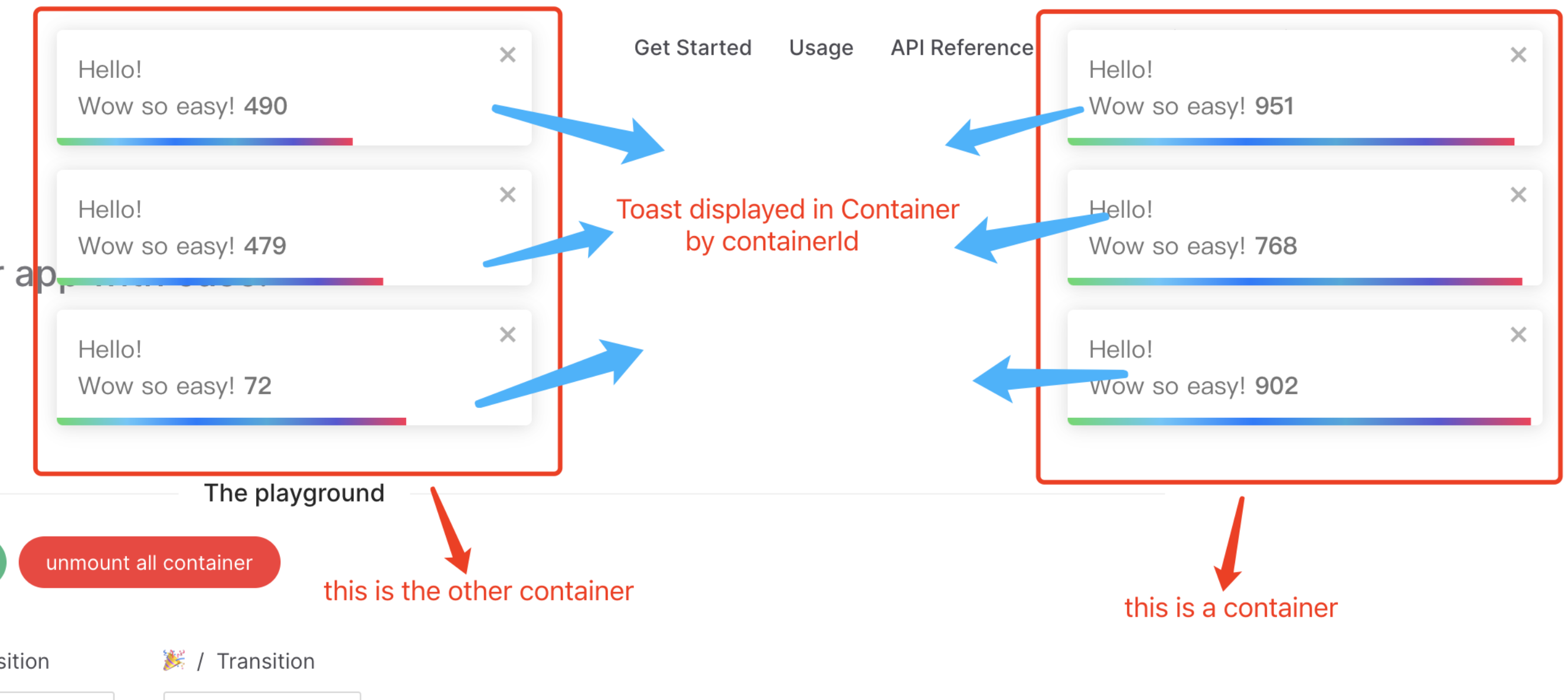
| containerId | Id | toast.POSITION.TOP_RIGHT | Used to identify the Container when working with multiple container. Also used to set the id attribute |
| position | ToastPosition | toast.POSITION.TOP_RIGHT | One of top-right, top-center, top-left, bottom-right, bottom-center, bottom-left |
| autoClose | number | boolean | 5000 | Delay in ms to close the toast. If set to false, the notification needs to be closed manually |
| closeButton | VNode | boolean | default close icon | Replace the default close button or false to hide the button |
| transition | ToastTransition | CSSTransitionProps | toast.TRANSITIONS.Bounce | A reference to a valid transition animation |
| hideProgressBar | boolean | false | Display or not the progress bar below the toast(remaining time) |
| pauseOnHover | boolean | true | Keep the timer running or not on hover |
| pauseOnFocusLoss | boolean | true | Pause the timer when the window loses focus |
| closeOnClick | boolean | true | Dismiss toast on click |
| toastClassName | string | - | Add optional classes to the toast |
| bodyClassName | string | - | Add optional classes to the toast body |
| style | CSSProperties | - | Add optional inline style to the container |
| progressClassName | string | - | Add optional classes to the progress bar |
| progressStyle | CSSProperties | - | Add optional inline style to the progress bar |
| role | string | alert | Define the ARIA role for the toasts |
| theme | ToastTheme | auto | One of auto, light, dark, colored, auto means automatically detects system theme colors |
TIP
By default, all toasts will inherit container props. Props defined on toast supersede container props. The demo is not exhaustive, check the doc for more!
Define the Container Props
ts
import { createApp } from 'vue';
import Vue3Toastify, { type ToastContainerOptions } from 'vue3-toastify';
import App from './App.vue';

const app = createApp(App);

app.use(
  Vue3Toastify,
  {
    autoClose: 2000,
    style: {
      opacity: '1',
      userSelect: 'initial',
    },
  } as ToastContainerOptions,
);

app.mount('#app');
TIP
You can also use updateGlobalOptions hook to defined the container props.
ts
updateGlobalOptions({
  autoClose: 2000,
  style: {
    opacity: '1',
    userSelect: 'initial',
  },
});
then use it per toast
ts
toast.success('Wow so easy!');