Toast Props
Props
TIP
When displaying a toast, the props are inherited from the container props. Toast props supersede container props
| Props | Type | Default Value | Description |
|---|---|---|---|
| toastId | Id | - | Provide a custom id |
| updateId | Id | - | Used during update |
| data | T | - | any additional data you want to pass toast("hello", { data: {key: value} } as T) |
| type | ToastType | 'default' | One of info, success, warning, error, default |
| delay | number | - | Let you delay the toast appearance. Pass a value in ms |
| onOpen | () => void | - | Called when the notification appear |
| onClose | () => void | - | Called when the notification disappear |
| onClick | (event: MouseEvent) => void | - | Called when click inside Toast notification |
| toastStyle | CSSProperties | - | Add optional inline style to the toast wrapper |
| progress | number | - | Set the percentage for the controlled progress bar. Value must be between 0 and 1. |
| render | ToastContent<T> | - | Only available when using toast.update |
| isLoading | bollean | - | Only available when using `toast.loading' |
| dangerouslyHTMLString | boolean | false | render unsafe string, like html tag |
| clearOnUrlChange | boolean | true | clear this toast on url change. Set false to keep it across navigation |
| icon | IconType | - | Used to display a custom icon. Set it to false to prevent |
| rtl | boolean | false | Support right to left content |
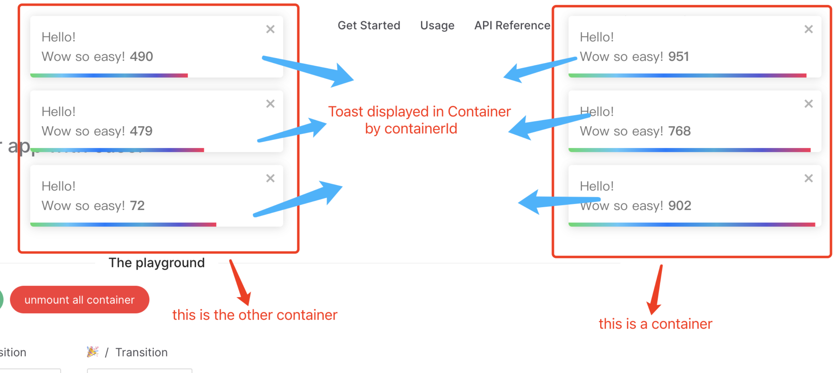
| containerId | Id | toast.POSITION.TOP_RIGHT | Used to identify the Container when working with multiple container. Also used to set the id attribute |
| position | ToastPosition | toast.POSITION.TOP_RIGHT | One of top-right, top-center, top-left, bottom-right, bottom-center, bottom-left |
| autoClose | number | boolean | 5000 | Delay in ms to close the toast. If set to false, the notification needs to be closed manually |
| closeButton | VNode | boolean | default close icon | Replace the default close button or false to hide the button |
| transition | ToastTransition | CSSTransitionProps | toast.TRANSITIONS.Bounce | A reference to a valid transition animation |
| hideProgressBar | boolean | false | Display or not the progress bar below the toast(remaining time) |
| pauseOnHover | boolean | true | Keep the timer running or not on hover |
| pauseOnFocusLoss | boolean | true | Pause the timer when the window loses focus |
| closeOnClick | boolean | true | Dismiss toast on click |
| toastClassName | string | - | Add optional classes to the toast |
| bodyClassName | string | - | Add optional classes to the toast body |
| style | CSSProperties | - | Add optional inline style to the container |
| progressClassName | string | - | Add optional classes to the progress bar |
| progressStyle | CSSProperties | - | Add optional inline style to the progress bar |
| role | string | alert | Define the ARIA role for the toasts |
| theme | ToastTheme | auto | One of auto, light, dark, colored, auto means automatically detects system theme colors |
Usages
All the toast methods return a toastId except remove and isActive. The toastId can be used to remove a toast programmatically or to check if the toast is displayed.
ts
const options = {
  onOpen: () => console.log('opened'),
  onClose: () => console.log('closed'),
  autoClose: 6000,
  closeButton: SomeVNode, // CloseBtnType
  type: toast.TYPE.INFO,
  hideProgressBar: false,
  position: toast.POSITION.TOP_LEFT,
  pauseOnHover: true,
  transition: MyCustomTransition,
  progress: 0.2
  // and so on ...
} as ToastOptions;

// display toasts
const toastId = toast("Hello", options as ToastOptions);
toast(MyComponent, options as ToastOptions);
toast(({ closeToast } as ToastContentProps) => <div>Render props like</div>, options as ToastOptions);

//shortcut to different types
toast.success("Hello", options as ToastOptions);
toast.info("World", options as ToastOptions);
toast.warn(MyComponent, options as ToastOptions);
toast.error("Error", options as ToastOptions);

// New: object content (built-in title + content layout)
toast.success({
  title: 'The toast title',
  content: 'Some toast content',
});

// Remove all toasts !
toast.remove();
toast.clearAll();

// Remove given toast
toast.remove(toastId as Id);

//Check if a toast is displayed or not
toast.isActive(toastId);

// update a toast
toast.update(toastId, {
  type: toast.TYPE.INFO,
  render: SomeVNode, // ToastContent<T>
});

// completes the controlled progress bar
toast.done(toastId as Id);