Icons
Built-in icons
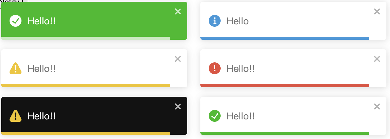
Notifications of different types (toast.info, toast.error, toast.success, toast.warning) display an icon associated with the selected type.
Disable icons
- Disable the icon individually
- Disable the icon gloabally
Custom icons
Custom icons globally
TIP
Code in Jsx:
jsx
toast('HELLO', {
  icon: ({ theme, type }) => (
    <ComponentIcon
      theme={theme}
      type={type}
      class={theme}
      style={{ fontSize: '12px' }}
    />
  ),
});